
Transform Your Space and Style with the Perfect Colors
Colors have the power to shape how we feel, think, and even live. Whether you’re decorating your home, designing your brand, or curating wall art, the right color palette can bring harmony, emotion, and personality to your world.
In this guide, you’ll discover how to create and use color palettes effectively — from understanding warm and cool tones to exploring trending pastel and neutral combinations for 2025.
Table of Contents
Let’s unlock the art of color together.
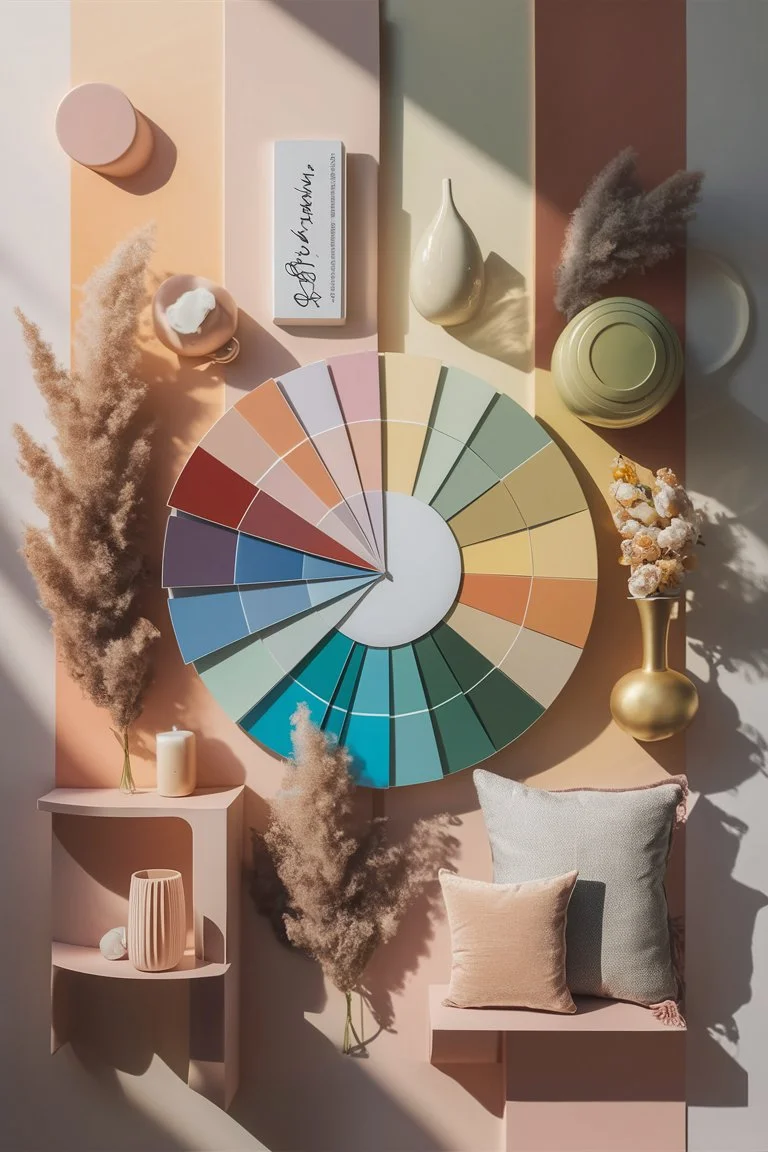
1. What Is a Color Palette and Why It Matters
A color palette is more than just a group of colors — it’s a visual language. It’s the set of hues that defines the tone, emotion, and aesthetic of your space or design.
When used thoughtfully, a palette creates balance and flow, ensuring that every color complements the other. In interior design, a well-chosen palette can make a small space feel larger, a minimalist room feel cozy, or an eclectic area feel intentional.
Think of your color palette as your design’s emotional fingerprint — unique, expressive, and deeply personal.
2. Understanding Color Psychology
Before choosing your palette, it’s essential to understand how colors influence mood and perception:
- Warm colors (reds, oranges, yellows) evoke energy, warmth, and excitement. Perfect for living rooms, kitchens, or creative spaces.
- Cool colors (blues, greens, purples) bring calm, serenity, and focus — ideal for bedrooms or offices.
- Neutral colors (beige, gray, white, taupe) add elegance and flexibility, serving as a timeless backdrop for art and decor.
- Pastel tones (soft pinks, mint greens, sky blues) feel fresh, optimistic, and inviting — excellent for modern or Scandinavian interiors.
Understanding this psychology helps you design spaces that reflect the atmosphere you want to create.
3. How to Create a Color Palette: Step-by-Step Guide
If you’re wondering how to create a color palette that truly works for your space or project, follow these simple steps:
Step 1: Define the Mood
Start by asking: How do I want this room (or design) to feel?
Is it calm, energizing, romantic, minimalist, or bold? Your emotional goal sets the tone for the palette.
Step 2: Choose a Base Color
This is your anchor — the dominant hue that defines the space. In home decor, this could be your wall color, rug, or main furniture tone.
Step 3: Add Complementary Shades
Use a color palette generator (like Adobe Color or Coolors) to find hues that naturally complement your base tone.
Step 4: Balance Warm and Cool Tones
Even in a neutral color palette, add a touch of warmth or coolness for depth — for example, a beige wall with soft blue accents.
Step 5: Use the 60-30-10 Rule
This timeless design formula keeps harmony:
- 60% dominant color (walls, large surfaces)
- 30% secondary color (furniture, textiles)
- 10% accent color (art, pillows, decor)
4. Color Palette Ideas for Every Style
Whether your vibe is modern, boho, or minimalist, these color palette ideas will help inspire your next project.
Modern Minimalist Palette
- White, Charcoal Gray, Sand, and Soft Black
- Sleek and timeless, this look pairs perfectly with metallic accents and bold wall art.
Boho Chic Palette
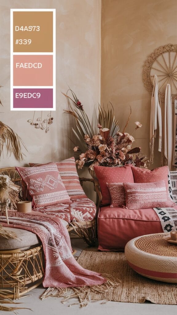
- Terracotta, Mustard Yellow, Forest Green, and Cream
- Add woven textures, dried flowers, and patterned textiles for a cozy, free-spirited feel.
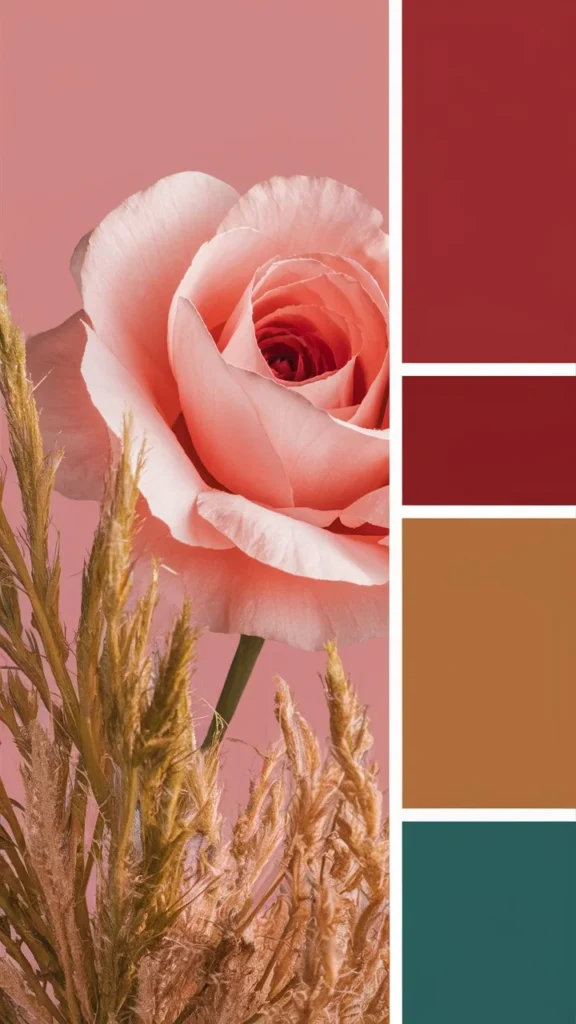
Warm Color Palette
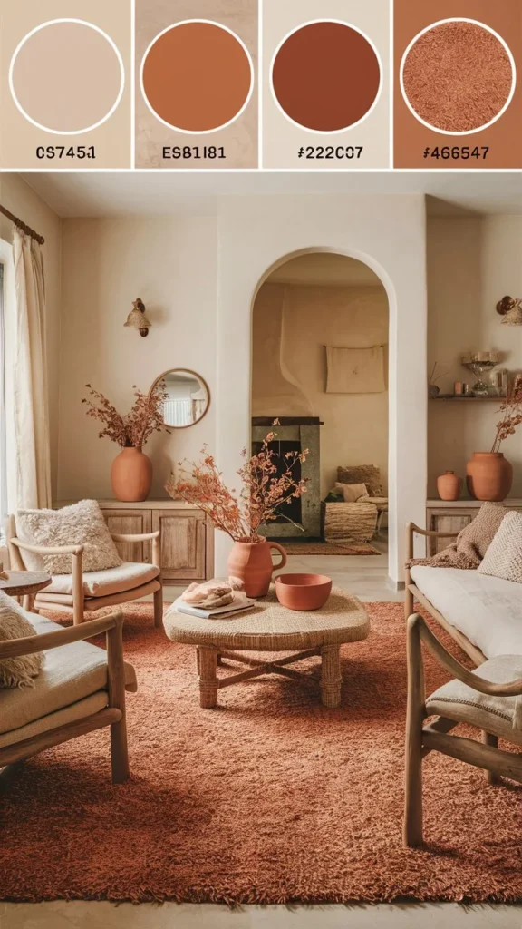
- Burnt Orange, Deep Brown, Golden Yellow, and Blush
- Perfect for autumn decor or cozy living rooms — radiates comfort and charm.
Pastel Color Palette
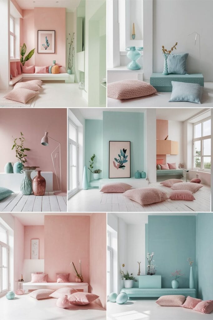
- Dusty Pink, Mint, Sky Blue, and White
- Light, airy, and uplifting — ideal for bedrooms or nurseries.
Neutral Color Palette
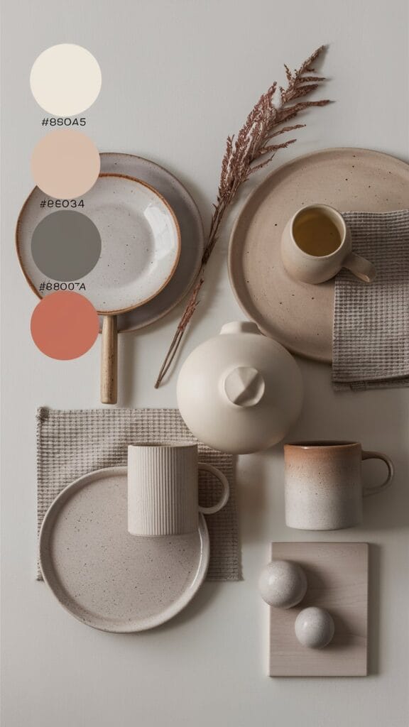
- Ivory, Taupe, Beige, and Stone Gray
- Versatile and sophisticated; complements both minimalist and luxurious interiors.
Nature-Inspired Palette
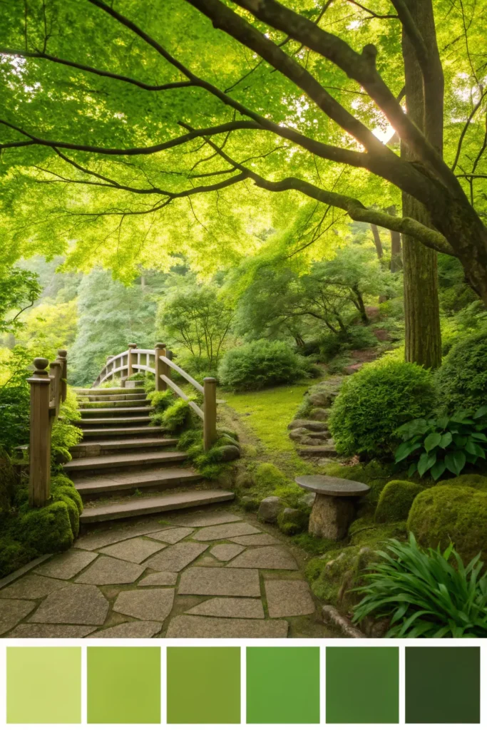
- Olive Green, Warm Earth, Sandstone, and Sky Blue
- Connects your interior to the calming essence of the outdoors.
5. Using Color Palettes in Interior Design
Your color palette for interior design determines how your home feels and flows. Here’s how to use it effectively:
- Living Room: Combine warm and neutral tones for a welcoming atmosphere. Try a beige sofa with burnt orange cushions and golden lighting.
- Bedroom: Opt for a pastel color palette to promote calm — think blush walls, white linens, and soft wood accents.
- Bathroom: Go minimal with whites and grays, and add a cool blue or green for a spa-like vibe.
- Kitchen: Experiment with bold contrasts — deep green cabinets with brass handles and light quartz counters.
Don’t forget to add wall art that complements your palette. A cohesive color story makes any artwork feel like part of the room’s soul.
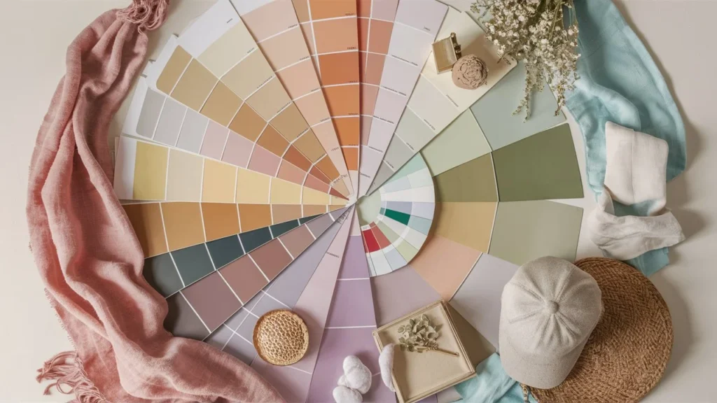
6. Tools to Generate and Test Color Palettes
Thankfully, you don’t need to be an artist to find the perfect palette. Try these popular color palette generators:
- 🎨 Coolors.co – Quickly build harmonious palettes and explore trends.
- 🌈 Adobe Color Wheel – Great for professional designers and branding work.
- 🪶 Canva Color Palette Generator – Upload an image and get instant palette inspiration.
- 🧡 Colormind – Uses AI to create modern color combinations.
These tools let you test combinations for websites, logos, or wall art — ensuring your visuals always feel balanced and cohesive.
7. Trending Color Palettes for 2025
Every year brings a new wave of trending tones. Here’s what’s hot in color palette ideas for 2025:
- Earthy Neutrals: Clay, Terracotta, and Olive tones are dominating interiors.
- Soft Pastels: Misty blues, sage greens, and muted pinks for gentle elegance.
- Warm Vintage Vibes: Mustard, Brown Sugar, and Peach echo nostalgic coziness.
- Serene Blues: Deep navy and sky blue combinations symbolize calm and trust.
- Modern Metallics: Brushed gold and bronze accents are back in design focus.
Incorporating these trends into your decor gives your home a fresh, stylish feel that still feels timeless.
8. Color Palettes and Wall Art: A Perfect Match
At Wall Art Inspiration, we believe color and art go hand in hand. A beautiful wall art piece can anchor your entire palette.
For example:
- A warm abstract painting can tie together beige and amber tones in your living room.
- A pastel floral print adds softness to a minimalist bedroom.
- A black-and-white photograph contrasts perfectly in a colorful space, bringing balance.
When choosing wall art, consider the color relationships — your palette should feel like a conversation between your furniture, walls, and artwork.
9. Common Mistakes to Avoid When Choosing a Color Palette
Even creative decorators make color mistakes. Avoid these common pitfalls:
- Using too many colors. Limit your palette to 3–5 shades.
- Ignoring natural light. A color that looks great in the store may appear dull at home.
- Skipping undertones. Warm beige and cool beige can clash if mismatched.
- Forgetting texture. Matte, glossy, and fabric surfaces reflect colors differently.
- Neglecting continuity. Every room should flow into the next with related hues.
10. Final Tips for Building the Perfect Color Palette
- Start small: Test your palette with accessories or wall art before painting entire walls.
- Trust your instincts: Your home should reflect your personality, not just trends.
- Use inspiration boards: Pinterest and interior design blogs can help visualize combinations.
- Revisit seasonally: Swap accent colors in cushions, vases, or throws to refresh the space.
The best color palette isn’t about following rules — it’s about creating harmony that feels uniquely you.
Conclusion: Let Color Tell Your Story
A color palette is more than just decoration — it’s storytelling through shades. Whether you prefer warm earthy tones, soft pastels, or a neutral minimalist design, every hue adds depth and meaning to your home.
So, the next time you’re choosing paint, wall art, or furniture, remember: color is your most powerful design tool . jn
Let your walls, art, and style speak in color.