
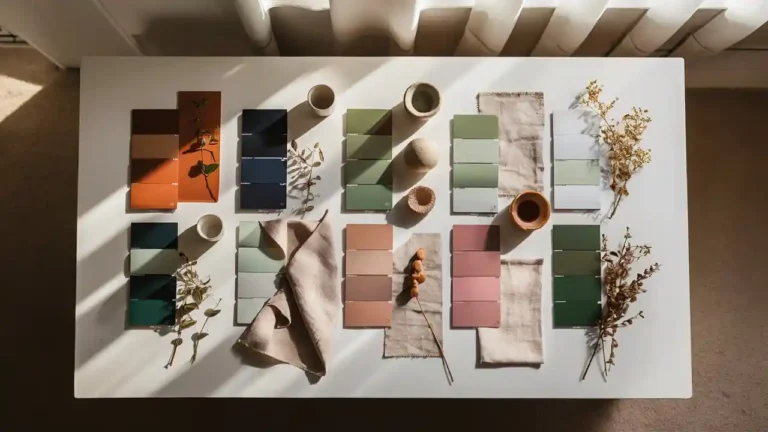
Are you ready to give your home a fresh new look? Whether you’re planning a full renovation or just want to refresh a single room, choosing the right color palette is the most powerful — and most affordable — change you can make.
Pinterest searches for home color palettes have skyrocketed by 600% this year, proving that people everywhere are craving beautiful, cohesive interiors. In this guide, we’ve rounded up the 10 most-searched, most-saved color combinations of 2026 — complete with practical tips on how to use each one in your home.
Pro tip: Save this article — you’ll want to come back to it before your next paint shopping trip!
Table of Contents
1. Earthy Terracotta & Warm Sand

This palette is dominating interior design in 2026, and for good reason. Inspired by sun-baked landscapes and artisan pottery, terracotta combined with warm sand creates spaces that feel grounded, cozy, and deeply inviting.
Best rooms for this palette:
- Living rooms and reading nooks
- Dining rooms with exposed brick or wooden furniture
- Boho-style bedrooms
How to use it:
Paint your walls in a warm sand tone like Sherwin Williams’ Accessible Beige or Antique White. Add terracotta through throw pillows, ceramic vases, a woven rug, or an accent wall. Layer in natural textures — jute, linen, rattan — to complete the look.
Color to search: Sherwin Williams Earth Tone Paint Colors — trending +60% year over year on Pinterest.
2. Deep Navy & Crisp White
Classic, elegant, and endlessly versatile — the navy and white combination never goes out of style. In 2026, it’s getting a fresh update with matte finishes, bold navy cabinetry, and white linen textures.
Best rooms for this palette:
- Kitchens and laundry rooms
- Bathrooms for a spa-like feel
- Home offices for a focused, professional atmosphere
How to use it:
Go bold with navy kitchen cabinets paired with white marble countertops. Or keep it subtle with navy accessories — frames, lanterns, throw blankets — against all-white walls. This palette photographs beautifully for Pinterest!
Blue layout searches have grown 2,500% annually. This is a massive opportunity for your blog.
3. Sage Green & Linen White

Sage green has been a slow-burn trend for a few years, and in 2026 it’s fully mainstream. Paired with linen white or off-white, it creates interiors that feel calm, fresh, and connected to nature.
Best rooms for this palette:
- Bedrooms — especially for a peaceful, sleep-friendly environment
- Kitchens for a soft, vintage-inspired feel
- Bathrooms with natural wood accents
How to use it:
Paint one wall in sage and keep the rest linen or soft white. Introduce botanical prints, wicker furniture, and linen curtains. A few dried eucalyptus stems in a ceramic vase will tie the whole look together.
4. Dusty Pink & Warm Grey
Soft, romantic, and surprisingly sophisticated — dusty pink paired with warm grey is the palette that’s winning over millennial homeowners. It feels modern without being cold, and feminine without being overly sweet.
Best rooms for this palette:
- Nurseries and children’s rooms
- Master bedrooms
- Living rooms with velvet furniture
How to use it:
Use warm grey as your base wall color and bring in dusty pink through velvet cushions, a tufted headboard, or a statement armchair. Metallic gold accents in lamps and picture frames will elevate this palette instantly.
Pink layout searches have surged 1,500% year over year. Your audience is actively searching for this!
5. Warm White & Blonde Wood
Scandinavian minimalism meets warm hygge in this palette. Clean, airy, and incredibly liveable — warm white walls with blonde or natural wood elements create spaces that feel both modern and welcoming.
Best rooms for this palette:
- Open-plan living and dining areas
- Home offices and studios
- Hallways and entryways
How to use it:
Keep walls warm white (avoid bright white — it can feel sterile). Introduce blonde wood through flooring, floating shelves, a dining table, or a coffee table. Add texture through chunky knit throws, linen cushions, and simple ceramic objects.
6. Moody Forest Green & Brass
For those who want drama without going full dark academia, this combination delivers. Deep forest green paired with warm brass creates a luxurious, jewel-box feel that looks incredible in both traditional and modern homes.
Best rooms for this palette:
- Living rooms with high ceilings
- Dining rooms for an impressive atmosphere
- Home bars or entertainment rooms
How to use it:
Paint all four walls in a deep forest or bottle green — don’t be afraid to commit! Pair with brass hardware, pendant lights, and gold-framed art. Natural materials like dark walnut wood and leather will anchor the space.
7. Soft Terracotta & Rust with Cream
A warmer, more saturated version of the earthy palette, this combination draws from Southwestern and Mediterranean design traditions. It’s bold, joyful, and full of personality.
Best rooms for this palette:
- Kitchens — especially with open shelving
- Covered outdoor patios
- Accent walls in any room
How to use it:
Use cream or off-white as your dominant color and introduce terracotta and rust through tiles, painted furniture, or hand-thrown pottery. Mexican Talavera tiles in a kitchen backsplash look stunning with this palette.
8. Charcoal & Natural Stone
For a sleek, contemporary look, charcoal grey paired with natural stone textures (marble, limestone, travertine) creates spaces that feel both luxurious and timeless.
Best rooms for this palette:
- Bathrooms — especially with big tile showers
- Modern kitchens
- Entryways with stone flooring
How to use it:
Use large-format tiles in a natural stone look for floors or shower walls. Paint surrounding walls in a soft charcoal. Add warmth through matte black fixtures and wood accents. Big tile in shower searches are up significantly this year!
Big tile in shower is a trending search with +100% monthly growth. Use this exact phrase in your content!
9. Butter Yellow & Soft White
Fresh, optimistic, and deeply cheerful — butter yellow is having its biggest moment since the 1970s. But this time it’s been updated with sophisticated application methods and better pairings.
Best rooms for this palette:
- Kitchens — especially painted cabinets
- Sunrooms and breakfast nooks
- Children’s playrooms
How to use it:
Go subtle with a soft butter yellow on just the kitchen island or a single accent wall, keeping everything else soft white. Or go bold with yellow painted cabinets — trending massively on Pinterest right now. Pair with brushed brass hardware and white marble for a timeless finish.
10. Blue & White with Natural Rattan
Coastal living meets contemporary design in this fresh, breezy combination. Blue and white is eternally popular, but in 2026 the addition of natural rattan, seagrass, and woven textures gives it a grounded, organic feel.
Best rooms for this palette:
- Living rooms and bedrooms
- Coastal and lake house properties
- Bathrooms for a fresh, clean feel
How to use it:
Use a medium-toned blue (think denim or ocean blue, not navy) on an accent wall or through large upholstered pieces. Keep surrounding walls white or cream. Layer in rattan chairs, seagrass baskets, and white linen curtains for maximum Pinterest-worthy appeal.
How to Choose the Right Color Palette for Your Home

With so many beautiful options, how do you decide? Here are a few guiding principles:
- Start with what you already own: your furniture, flooring, and fixed elements will point you toward certain palettes.
- Consider natural light: darker rooms benefit from warm, light-reflecting palettes; bright rooms can handle deeper, moodier colors.
- Think about the feeling you want: calm and restful? Energizing and social? Each palette creates a different emotional atmosphere.
- Test before committing: always get sample pots and observe the color at different times of day before painting an entire room.
- Stick to a max of three colors per room: a dominant color (60%), a secondary (30%), and an accent (10%).
Which of these palettes speaks to you most? Share your color journey in the comments below — we love seeing your real homes and before-and-after transformations!
And if you found this guide helpful, pin it to your Home Decor board so you can find it again when you’re ready to shop for paint! 🎨